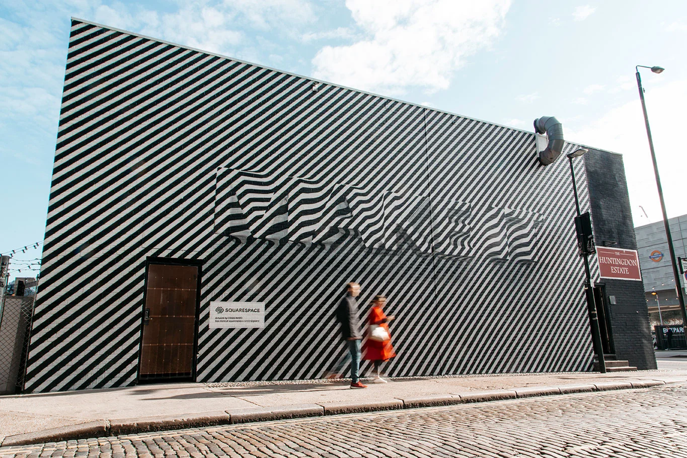
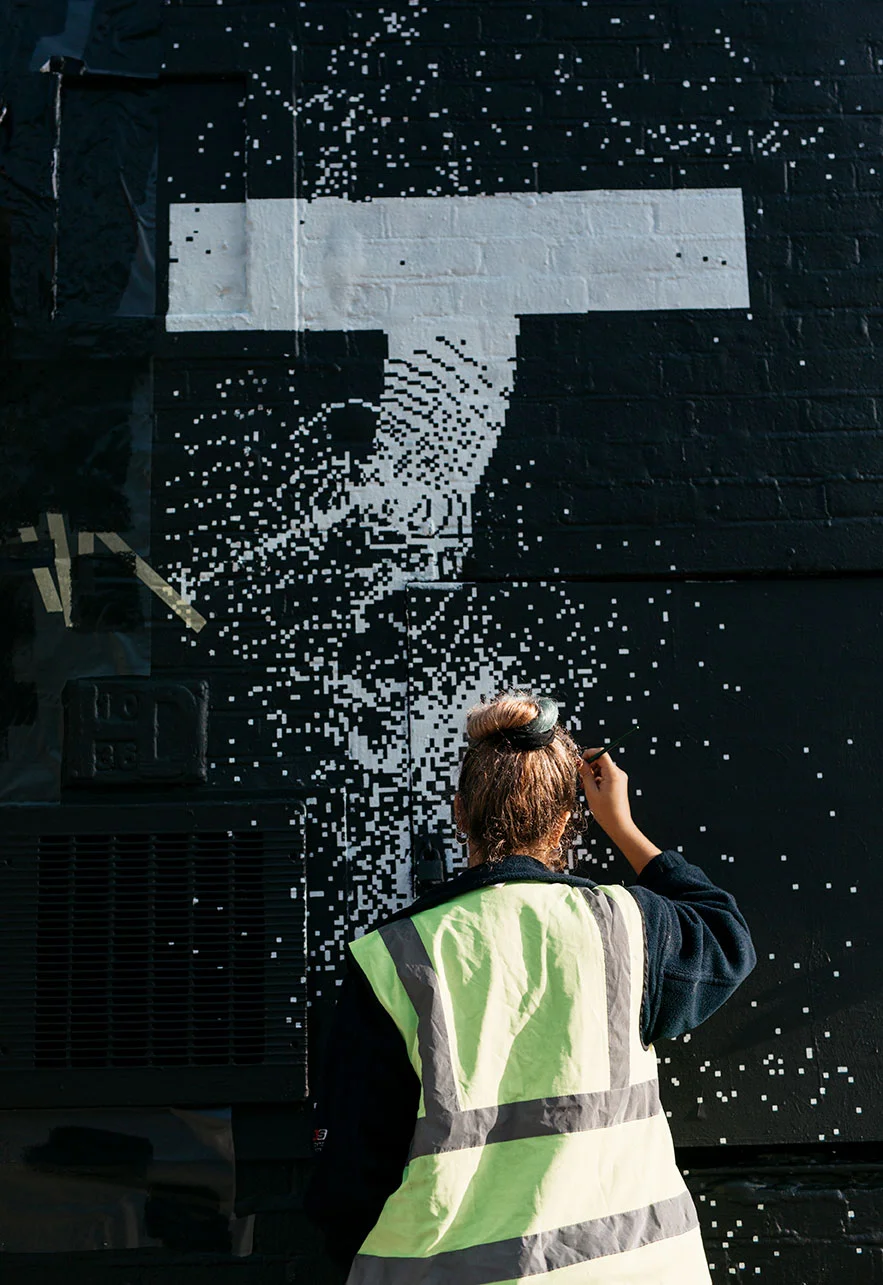
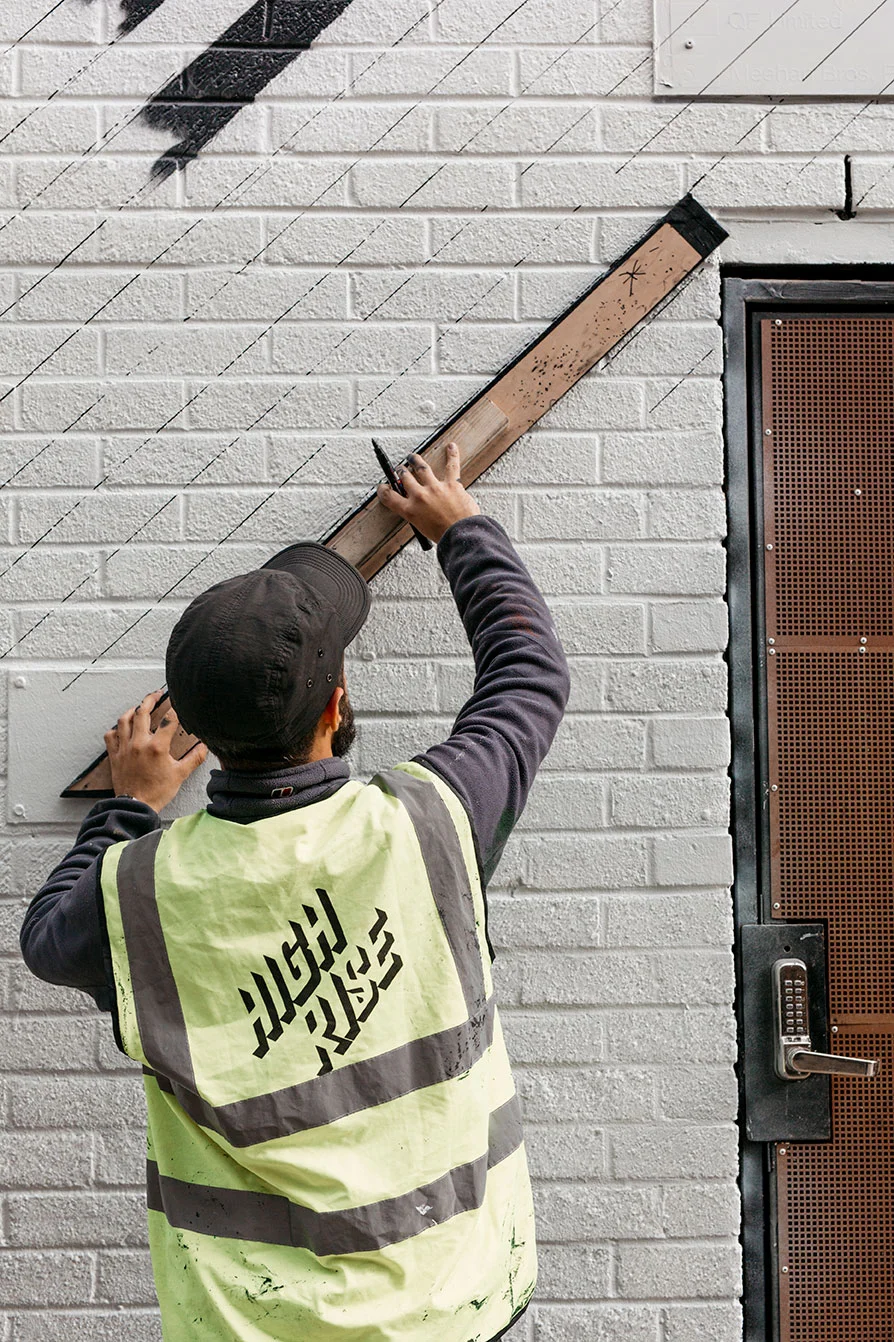
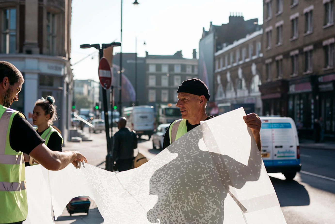
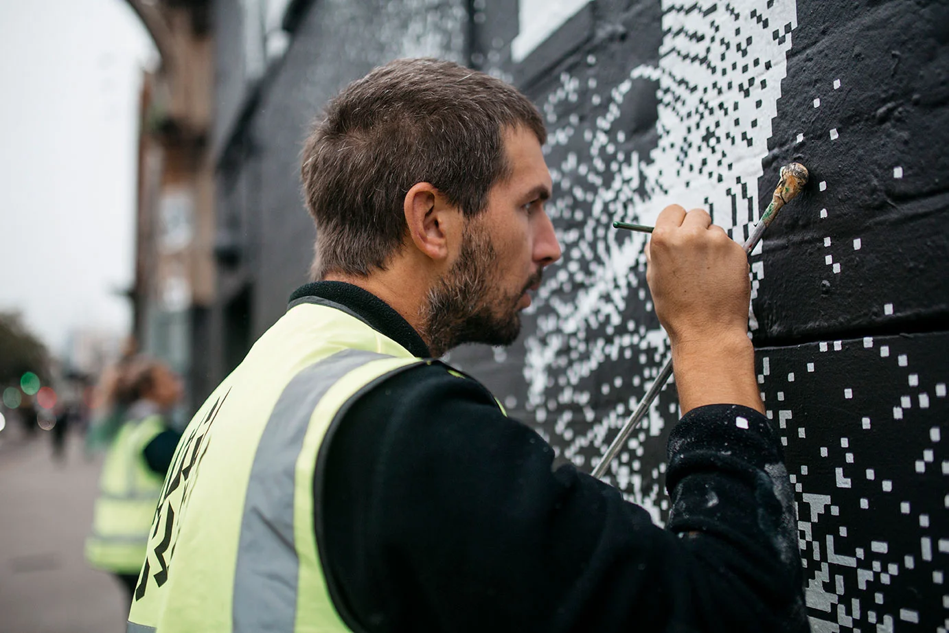
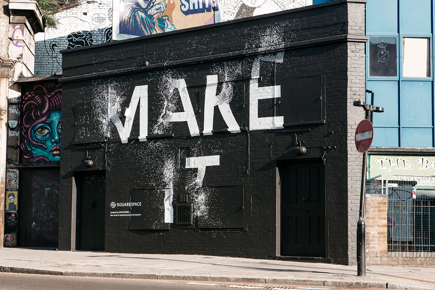
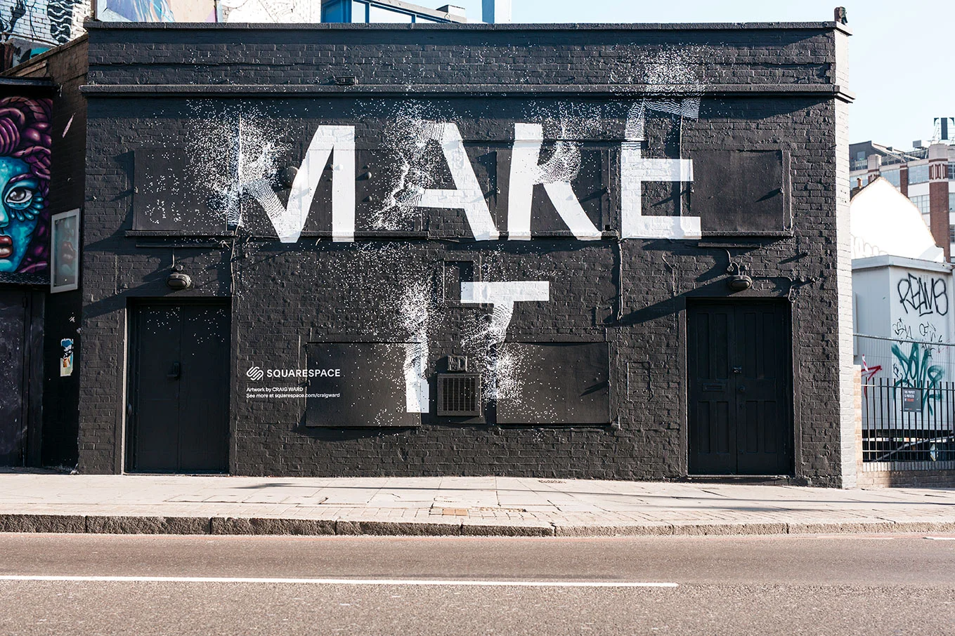
Squarespace tested our skills back in October with two envelope pushing concepts created by US based British born typography pioneer Craig Ward. Communicating their simple and direct ‘Make It’ message Squarespace presented us with a unique 3D treatment, floating the MAKE IT message out of a monochrome striped pattern on Ebor St and an exploding pixelated type on the Great Eastern gallery. Both were fantastic examples of what you can do when you push the boundaries of typography to deliver a simple, consistent message. We were delighted to take on Craig's challenge and, thanks to our amazing artists, we absolutely nailed it.


